
Black Login Page Design In Html And Css With Source Code Codepen Type
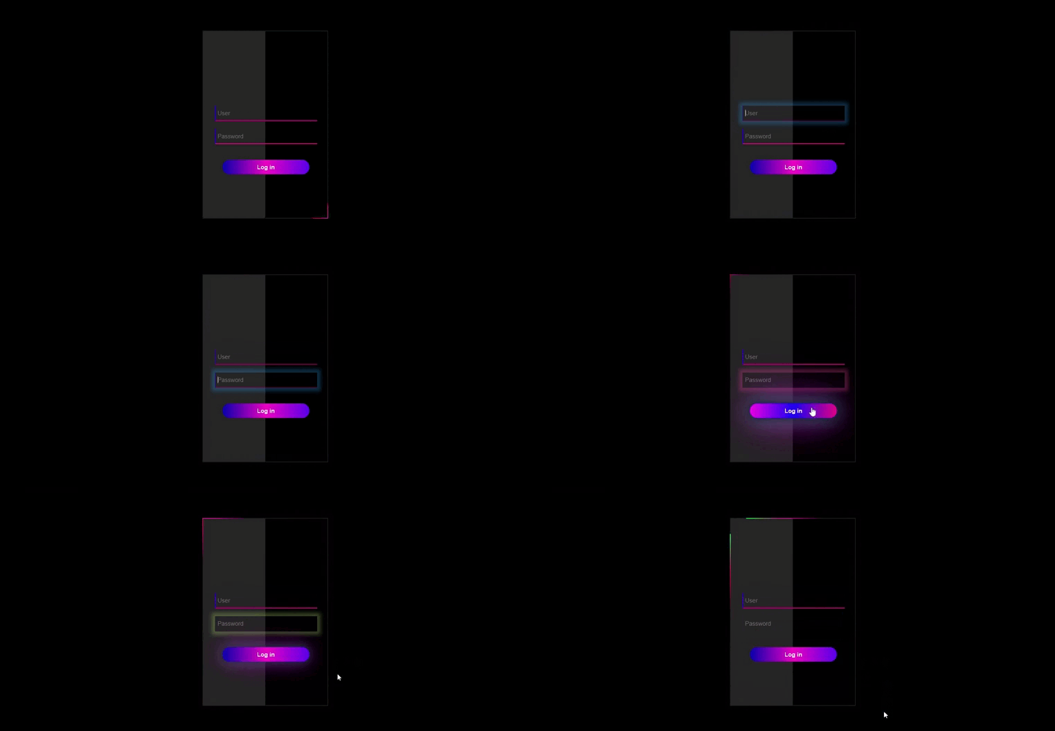


<!DOCTYPE html>
<html lang="en">
<head>
<meta charset="UTF-8">
<meta http-equiv="X-UA-Compatible" content="IE=edge">
<meta name="viewport" content="width=device-width, initial-scale=1.0">
<title>Document</title>
<style>
body {
margin: 0;
padding: 0;
min-height: 100vh;
font-family: sans-serif;
-webkit-tap-highlight-color: rgba(0, 0, 0, 0);
}
.hero {
min-height: 100vh;
width: 100%;
background: #000000;
position: absolute;
}
div {
box-sizing: border-box;
}
/*main box*/
.main-box {
width: 320px;
height: 480px;
position: relative;
margin: 6% auto;
background: #1b1b1b;
display: flex;
justify-content: center;
align-items: center;
overflow: hidden;
}
.sp {
position: absolute;
transition: 0.5s;
}
.sp-t {
top: 0;
right: 0;
width: 200px;
height: 2px;
background: linear-gradient(to left, transparent, #ff00aa, #00ff22);
animation: anim2 2s linear infinite;
transform: translateY(-300%);
animation-delay: 0.8s;
}
.sp-r {
bottom: 0;
right: 0;
width: 2px;
height: 200px;
background: linear-gradient(to top, transparent, #00ff4c, #ff0095);
animation: anim1 2s linear infinite;
animation-delay: 0s;
}
.sp-b {
right: 0;
bottom: 0;
width: 200px;
height: 2px;
background: linear-gradient(to left, transparent, #01ff4d, #ff009d);
animation: anim2 2s linear infinite;
}
.sp-l {
left: 0;
top: 0;
width: 2px;
height: 200px;
background: linear-gradient(to top, transparent, #ff0062, #01ff4d);
animation: anim1 2s linear infinite;
animation-delay: 1s;
transform: translateX(-300%);
}
@keyframes anim1 {
0% {
transform: translateY(300%);
}
100% {
transform: translateY(-300%);
}
}
@keyframes anim2 {
0% {
transform: translateX(300%);
}
100% {
transform: translateX(-300%);
}
}
/*main box end*/
.form-box {
width: 316px;
height: 476px;
position: relative;
background: #252525;
padding: 5px;
overflow: hidden;
z-index: 5;
}
#after {
width: 50%;
height: 100%;
content: "";
position: absolute;
top: 0;
left: 50%;
background: #000000;
z-index: -1;
transition: 0.5s;
}
#btn {
position: absolute;
top: 0;
left: 0;
width: 110px;
height: 100%;
background: linear-gradient(to left, #ff0080, #000a91);
border-radius: 30px;
transition: 0.5s;
}
.cont-icon {
color: #000000;
font-size: 28px;
transition: transform 0.5s;
}
.input-group {
width: 320px;
display: flex;
flex-wrap: wrap;
justify-content: center;
top: 180px;
position: absolute;
padding: 0 30px;
transition: 0.5s;
box-sizing: border-box;
}
.input-field {
width: 100%;
padding: 10px 5px;
margin: 10px 0;
border-top: 0;
border-left: 2px solid #2f00ff;
border-right: 0;
border-bottom: 2px solid #ff008c;
outline: none;
background: transparent;
color: rgb(234, 234, 235);
font-size: 15px;
transition: 0.5s;
}
.input-field:focus {
border-left: 2px solid transparent;
border-bottom: 2px solid transparent;
animation: animINP 5s linear infinite, animBTN 5s linear infinite;
;
}
.submit-btn {
width: 85%;
padding: 10px 30px;
cursor: pointer;
display: block;
margin: 30px auto 0 auto;
background: linear-gradient(to right, #0a07b3, #ff00c8, #5f03f4);
border: 0;
outline: none;
border-radius: 30px;
position: relative;
z-index: 5;
box-sizing: border-box;
color: #fff;
font-weight: bold;
font-size: 15px;
transition: 0.5s;
}
.submit-btn:hover {
background: linear-gradient(to right, #ff02ea, #1c02ff, #f40388);
color: #fff;
border-radius: 30px;
box-shadow: 0 0 5px #0022e0,
0 0 25px #000000,
0 0 50px #57AAB4,
0 0 100px #ff00f2;
}
.span {
margin: 20px 0;
color: rgb(234, 234, 235);
font-size: 12px;
display: flex;
justify-content: center;
align-items: center;
}
#login {
left: 0px;
}
@keyframes a {
0% {
background-position: 0%;
}
100% {
background-position: 400%;
}
}
@keyframes animBTN {
0% {
box-shadow: 0 0 10px 9px rgba(3, 169, 244, 0.3);
}
33% {
box-shadow: 0 0 10px 9px rgba(244, 65, 165, 0.3);
}
66.9% {
box-shadow: 0 0 10px 9px rgba(255, 235, 59, 0.3);
}
100% {
box-shadow: 0 0 10px 9px rgba(3, 169, 244, 0.3);
}
}
</style>
</head>
<body>
<div class="hero">
<div class="main-box">
<div class="form-box">
<div id="after"></div>
<form id="login" class="input-group">
<input type="text" class="input-field" placeholder="User" required>
<input id="pwd" type="Password" class="input-field" placeholder="Password" required>
<input type="submit" class="submit-btn" value="Log in">
</form>
</div>
<span class="sp sp-t"></span>
<span class="sp sp-r"></span>
<span class="sp sp-b"></span>
<span class="sp sp-l"></span>
</div>
</div>
</body>
</html>
- Html Login Page
- Login Page Template
- Login Page App
- Login Page In Html With Css Code
- Login Page Template Bootstrap
- Http Login Page
- Galwaykart Login Page
- Login Page W3schools
How To Use This Cord
steps
- Fast One Copy Html File.
- Copy CSS File And Past Head Part Top Fo Html File.
- File Save Name.html
- Ran Html File
- Ready To Use